A creative imperative:
Unlocking the power of creative reports
By Julián Hernández
Getting the right information to the right people
How does a government talk to its people and the world? One traditional way is via the data-rich report: a tool for communicating an administration’s plans, wins and vision for the future. It’s a pity, then, that these crucial messages often go unheard.
Here, the team from Consulum’s Creative Practice give some advice on how governments can get their reports the attention they deserve. Read on after the video for more on how governments can ensure their intended audience are aware and engaged with important reports and data.

Government reports are integral tools for governance. But too often, that tool is not user-friendly. Reports can be dry and inaccessible, turning people off rather than drawing them in. This represents lost opportunities – to inform policy and law; to uplift and educate; to guide investors; to support emergency efforts, and much more. Putting a large report together takes time, money and expertise, but those resources go to waste if it’s never read or understood.
How can governments ensure that the right information reaches the people that matter, when it matters, in the right way? This is where a spark of creative inspiration is required – and imaginative approaches that we’re more accustomed to seeing from artists or innovative brands.
As Khaled AlShehhi, Executive Director of Marketing Communications in the UAE government, puts it: “Imagine a world where interactions with governments are as engaging as our favourite digital platforms. Bridging innovative communication with public interests is the art of connection in the digital era.”1
Give your content a sporting chance
Take, for example, the UK Sports Council’s annual report on the National Lottery Fund, which offers insights into the organisation’s performance and financial standing.2 It’s compelling data, of value to fans, players and the general public – but you wouldn’t know that by looking at it. Visually, the report is uninviting, consisting of plainly formatted tables and dense chunks of text. (No disrespect to the UK Sports Council – this is a standard and familiar style.)
A more creative approach would invite readers in. But most won’t even get that far: the document is hard to find unless you’re looking for it. A cursory Google search pulls up only government portals – no member of the public will stumble across this report while browsing, still less hear about it on TikTok. What could the UK Sports Council do differently to transform their annual report into an eagerly awaited, nationwide event?
Imagine a campaign targeting sports fans and lottery players. The centrepiece: iconic sports figures in a series of short, memorable videos, explaining how the National Lottery Fund makes a difference to #TeamBritain; how everyone’s a winner, from grassroots participants to Olympic champions. With interactive infographics, online users could explore how funding impacts their favourite sport at various levels, from youth club support to national team training.
A #TeamLottery social media challenge could encourage individuals, from athletes to fans, to share personal stories of the National Lottery Fund’s positive impact on their lives or on community sports, fostering a collective narrative of success.
Thinking even more ambitiously, popular sports events could also be utilised. Imagine an English Premier League game where shirt numbers correspond to notable statistics in the report – information that could be activated during live broadcasts, with sportscasters unpacking it for a huge, captive audience. The message could be further boosted with outdoor communication using high-quality visuals, compelling storytelling and localised data.
Such initiatives might require significant investment, but they would be noticed. The wider public would discover compelling reasons to participate in the National Lottery, while gaining understanding of its role in the country’s athletic achievements.
All this could be achieved with a different conception of what data can be and do. Data is not static. It lives and breathes, providing a dynamic reflection of society – and it can be communicated in ways that do justice to that richness.
Ten principles for activating creativity
Once you’ve resolved to bring creativity into your process, the options are limitless. At Consulum, we’ve worked on a range of reports for various governments, helping them to align strategy, policy and communications. Drawing on these experiences, we’ve devised ten creative principles to help you elevate a report from dull to dazzling – and by doing that, achieve real impact.

1. Put your audience first
Understanding your audience is foundational to all effective communication. If you know who you’re speaking to and keep them front of mind, you can find the right channels, formats and language to convey even complex information. An audience-centric approach can also encourage public engagement, address concerns and misconceptions and build trust.
Most people are more keen to play a game than visit a government website. In 2013, the Australian Bureau of Statistics used real census data to create an interactive app. In “Run That Town”, players were urged to manage a virtual neighbourhood: “Choose from hundreds of projects for your town – from the practical to the preposterous. What kind of leader will you be? Will you be treated to a ticker tape parade, or chased out of town by an angry mob?”3 By tweaking policies and budgets, players could witness the direct effects of their choices. This ingenious approach bypassed traditional channels to engage a broader demographic and communicate data’s crucial role in governing.

2. Use visual communication
Materials are more effective when they’re pleasing to interact with. Attractive reports summarise key points and data in an easily digestible way, keeping clarity paramount. A world of visual innovation exists beyond traditional infographics: level up from 2D charts and visual aids and explore high-visibility physical installations and experiences that the press, government ecosystems and public can’t ignore.
In 2017, the International Fund for Agricultural Development (IFAD) produced “The Field Report” to encourage investment in smallholder agriculture in Africa. The way they did so was startlingly original – and probably visible from space.
With the participation of a group of small farmers in Zambia, a series of graphs from the report were tilled into the soil to illustrate pertinent figures about the role of agriculture in reducing rural poverty. The project literally brought the numbers off the page and made them both tangible and impossible to miss.4
3. Bring stories to life
Humans respond to stories. Framing your findings as a narrative, interwoven with relatable, real-life testimony, helps readers to connect to the content on a personal level, and remember it. Multiple storytelling channels can work: websites, social posts, podcasts, films and books all have their advantages and attractions.
The 2015 Pfizer Annual Review, “What We’re Working On”, featured numerous short clips of Pfizer scientists talking about their own research. It’s a great example of how stories of progress are often best told in the words of those personally leading the change. You can hear the passion in the researchers’ voices as they convey the overall impact of the organisation in multiple compelling narratives.
4. Get interactive
Nothing gets better word-of-mouth than an exciting user experience. Interactive online reports with clickable elements, multimedia content and user-friendly interfaces encourage exploration, engagement and curiosity. A modern report can take interactivity to its extremes – developed as a video game or as an immersive virtual reality (VR) or social media experience.
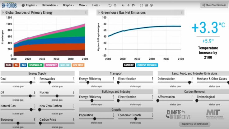
Developed by Climate Interactive, the MIT Sloan Sustainability Initiative and Ventana Systems, En-ROADS is an interactive global climate simulator. It allows users to assess the impact of various policies (such as electrified transport, carbon pricing or enhanced agricultural practices) on outcomes such as energy prices, temperature, air quality and sea-level rise. This offers a wide range of users – policymakers, educators, businesses, the media and the public – the chance to explore cross-sector climate solutions.5 You can try it out online on the Climate Interactive website.

5. Involve a diverse audience
A wide cross-section of the public can be rallied around a report through various creative, immersive experiences. Think stand-up comedy, hands-on workshops, social media campaigns, town-hall meetings, online forums, live theatre and music… all these formats can dramatise a report and engage its audience emotionally – and be tailored to specific groups like VIPs, journalists or influencers.
For their 2019 Playhouse event in Dubai, the Twitter (now X) marketing department selected some of the most successful, feel-good regional Twitter moments of the year and dramatised them in 16 short, entertaining live plays. The campaign was described as “demonstrating online power with an offline twist”. It got #2019onTwitter trending, was featured in more than 100 publications, and reached the region’s top brands and media decision makers.

6. Co-create with your audience
A report doesn’t have to be top-down. If an audience can be made to feel like active contributors – part of the process – they will bond more strongly with your content and be more open to your ideas. You can encourage participation through online platforms, polls or other participatory methods.
INJUV, Chile’s National Youth Institute, launched an online platform to empower millennials to contribute ideas for sustainable community development. Following the launch of the “Ideas para mi comunidad” (ideas for my community) project in 2020, activity on the platform soared, with young people engaging in national policy discussions. Ultimately, more than 620 proposals were shared, helping the government to design youth-related policies.6 Such collaborative tactics could be applied to writing reports for specific audiences.

7. Plan your earned media
Planning is essential to ensure your report is amplified. Identifying the most advantageous media context in which to release it means being at the right place at the right time and increasing impact and shareability. Sustain engagement with follow-up content, discussions and activities, in a cadence that keeps the report relevant and in the public consciousness. Think about where your audience’s interests lie – what topics or events could you leverage to boost your report’s visibility?
When Apple published its 2023 Environmental Progress Report, it was accompanied by an entertaining YouTube ad – at over five minutes, a mini movie – starring a stern “Mother Nature” descending on the boardroom to grill executives on climate-change commitment. Featuring actress Octavia Spencer and Apple CEO Tim Cook, the ad went viral on social media, attracting both praise and critique. Key to its success was its strategic release just ahead of Earth Day, with its built-in media buzz.
8. Mix it up with paid media
Never underestimate the power of integrated communications. A comprehensive media plan – with a judicious mix of earned and paid media – will ensure that a report is amplified and circulated throughout its target audiences. Paying for media is not something governments have generally done for reports in the past. But with so much jostling for audience attention, brand tactics have become vital for impact. Adequate media budgets are crucial, and reports should be high on the list of where that budget is spent. This might include sponsorships or partnerships with traditional as well as new media – including influencers, podcasters and Youtubers.
For the “State of Saudi Fashion Report” for the Fashion Commission, launched during Paris Fashion Week 2023, Consulum strategically partnered with the Financial Times to amplify its reach. The collaboration not only secured coverage through earned media but also benefited from robust paid media support, ensuring global acclaim and recognition.

9. Balance depth and form
A government report is a serious instrument, used to guide investment and diplomacy, communicate policy and agendas, and raise a country’s standing among nations. It should never seem gimmicky or frivolous. Creative elements should be fitting – enhancing rather than overshadowing the substance of the report. Ultimately, data still needs to be conveyed in depth and detail, and in a form that is useful and usable.
Allied Irish Bank (AIB) wanted to support sustainable Irish agriculture, including by increasing grass utilisation on livestock farms. “The Book That Grew” was the creative interpretation of this concept: a book made entirely of grass, with paper, text and binding all formed from sprouting grass. The stunning visual execution conveys a meaningful story – elevating the brand and making it a talking point without overwhelming its important message.

10. Consider personalisation
Data can be leveraged to provide personalised information to individual audience members. This targeted approach makes the most out of your data and delivers an intimate, super-relevant experience. Engagement is enhanced with relatable and actionable content tailored to specific demographics or circumstances. There are many inspiring examples of successful commercial applications of data-driven personalisation, but less so in the government report space. Generative AI is also making personalisation easier to achieve in practice.
Spotify Wrapped is an annual feature by the music streaming platform that offers users a personalised “year in review” – drawing on actual listening habits to highlight favourite songs, artists and genres as well as statistics like time spent on the app. The feature generates custom playlists and encourages users to share their Wrapped results on social media, engaging the audience and building a sense of community.
***
Defaulting to tables of data, dense text, and static layout is tempting because it is familiar. But is the result worth the effort?
A compelling government report of the future might deploy all ten of these elements, plus that spark of inspiration, to fulfil its potential as a force to shape a more informed and connected society.

About the author
Julián is Consulum’s Executive Creative Director. He is an expert at bringing policy and strategy to life through innovative design and branding campaigns, and harnessing world-class creativity to ensure government communications on a broad range of issues are widely accessible and compelling. He has worked with government organisations in South America, the Middle East and the Asia-Pacific region, across sectors including tourism, culture, digitisation, aviation and investment. Internationally recognised for his creativity, Julián has won numerous industry accolades for his work, including multiple Cannes Lions awards.
References
[1] Khaled AlShehhi, LinkedIn, January 2024, linkedin.com/feed/update/urn:li:activity:7150875648301903872/
[2] See for example Grant-in-Aid and National Lottery Distribution Fund Annual Report and Accounts for the year ended 31 March 2021, The United Kingdom Sports Council.
[3] Australian Bureau of Statistics, Census home/Apps & Education.
[4] “Change starts here: Small farmers with a big message for the world”, International Fund for Agricultural Development (IFAD).
[5] “The En-ROADS Climate Solutions Simulator”, Climate Interactive.
[6] Evy Beekers, “INJUV empowers 28,250 millennials to discuss sustainable development ideas for Chile”, citizenlab, August 26, 2020.

